In this session, we had to choose different briefs which we had to design some posters for it. We also looked at some examples of typographic designs created by other designers.
We had to combine what we looked at in the previous session like how to choose type and how to use it to define a word into this session. It's a development from the previous session.
There were different types of briefs, I had to choose 3 briefs and create 3 posters from it. Each brief provides information of what they are looking for, it also contains hints in it of the target audience and how to approach it and it is up to me to see those hints and act upon it to help me create the designs.
Before I started designing, I had to think of ideas of how I could design the posters which meant me looking at different posters on the internet for inspiration. The most important thing my posters had to have was a meaning behind everything, if something has a meaning behind it, it makes it better.
This brief below was called 'Acoustic Night'. I looked at it and the information I gathered from it was it has been running for 10 years so clearly it's quite successful for it to run that long. It wants to attract a more student audience.
They play different types of music genres, not just one type and it has a laid back mood to it and it is an open mic format.
The key information that I gathered from this is that it's quite laid back so I thought of creating something minimal to represent that and it doesn't just play one type of music so I thought to display that by including different types of instruments or music icons so the viewer would know that.

This is what I have designed....

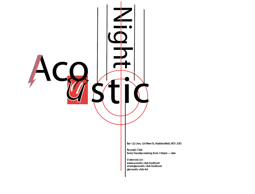
Above is the first design that I created. The rules were not to use images so I decided to turn the letters into a design if I wanted some type of visual design which I did, I turned the 'A' into the David Bowie iconic icon and turned the 'u' into the Rolling Stones icon. I did that to represent that the acoustic night plays different types of music.
I wanted to include some type of guitar look to represent the acoustic feel so I did that by using straight lines and created something that looks slightly like the strings of a guitar but not in an obvious way.
I included the information of the where and when the acoustic night was at the bottom which I had to include, this was stated in the brief. I used the straight line from the guitar design to direct the viewer's eye to the information.
The font I used for the words 'Acoustic Night' and the text at the bottom was 'Myriad Pro Regular', I thought it was simple and straight forward just like the information about the acoustic night.
Below is the second design that I have created for this brief.


For this one, I decided to focus more on the typography and not include any visual designs so all of the focus will be on the text. I tried to create a modern look to it because the brief stated that it wanted to attract a student led audience, I tried to do this by placing the text at different places, at different angles and different fonts.
I used this font for the words 'Acoustic Night' because I thought the 'o' looked like the middle of a guitar which went well with my guitar design.
I used 'PT Mono Regular' for the rest of the information. I used this font because the text was information about the event so I wanted something that stated the message because it was important that the font was easy to read but it also has a 'cool' look to it which goes well with the theme of the event.
I still kept the guitar design though because I thought it worked in the previous poster.
At first, I wasn't convinced in placing the text at different places and angles because I thought the viewer would find it hard to read it but after creating it, I don't think the audience will find it difficult to read the information on the poster but then again, that's just my opinion.
The next brief was called 'Interpret'.

This brief was about me choosing a designer and create a poster that represented their work by creating something that was similar but my own version of it.
I chose this designer because he designed the typeface of the Holland team at the 2014 World Cup, they were used on their jerseys and it's a typeface that I have always been a fan of but never knew who designed but now I do. I was excited to created my own version of it.
I had to find or create my own version of the typeface he used for his work. A typeface that relates to this designer.
I had to include the designer's name, uppercase and lowercase of the letters and the numbers which I didn't, as you can see below, I decided to just include the design's name but did include the uppercase.
Wim Crouwel
Willem Crouwel or also known as Wim Crouwel is a Dutch graphic designer, type designer and typographer.
The typeface he used for this is called 'Case Crouwel' which is based on the Dutch typographer's Gridnik typeface that was originally designed in 1974.
The main features of this typeface are thick straight lines and chamfered corners. I thought if I wanted the similar look, those were the features I wanted mine to have as well. From there, I had a starting point of how I wanted my typeface to look.
Below are some of his work.


I wanted to create a poster as a tribute to him, I wanted to celebrate his work on the Dutch national team and his typeface so I thought of creating a poster in a Dutch style and since he designed the typeface on the Dutch jerseys, it was only fair to include a jersey on the poster. This is what I came up with.
The typeface used for this was the closest typeface I could find and think of that was similar to Wim Crouwel's work, the only difference is the corners of the letters and the thin lines inside were only used for the numbers by Wim Crouwel but I decided to use it for the letters as well because I like the look of it.
At first, I had the idea of placing his name and a number on the jersey with this typeface, after experimenting with it, I didn't like the look of it, it wasn't until I played around with it and decided to enlarge his name and have his name as the main focal point so I made it big and bold in front of a jersey since he's the main reason for this poster, which is what I designed below.
The first image is the draft design I created, I wasn't happy with it because I felt like something was missing, I eventually had a great idea, since I divided his name into three sections, I could use the Dutch colours for his name since there are exactly three colours on the flag.


The next brief is called 'Craft Beer Expo 2017'. The Huddersfield Craft Beer Expo 2017 is taking place for the first time next year. It features the best independent brewers from all over the UK. This event wants to attract beer lovers from the north of the country. They want to look cool, friendly and fresh.

What I got from the brief was that they are looking for a cool, fresh and modern poster so I thought of doing something funny or some sort of pun as a way to connect with the viewer because overall, it does sound like it's a fun event where people can enjoy themselves and I want to convey that.
One thing that I felt like I had to do was to include some sort of reference to beer so the viewer knows what it is about and will attract the right audience.

Above is the first poster I have designed for this brief. The idea behind this poster was to attract the beer lovers immeditaly, I thought to myself, how would I do that? I decided to enlarge the word 'beer' and have lines to direct the viewer to the word, I tried to make it feel like something exciting was going on.
The typeface for the word 'beer' is 'Showcard Gothic Regular', I used that because I wanted a 'fun' and bold typeface to catch the viewer's eye.
The text underneath, I wrote 'now that I got your attention' because it's making it feel like the poster is talking directly to the viewer, it feels personal. Again with the typeface, I wanted something playful and fun which is why I went for 'Kristen ITC Regular'.
I went with the colour yellow for the background to represent the colour of beer, it would be something the viewer would feel familiar with.
I didn't include any information with it because I felt like there was still time for the event because it's in 2017, this poster is just a way to warn the viewers that there's a beer event soon.


For this one, I went with a funny theme to it, something the viewer can look at and laugh, it instantly connects with the viewer which is what I want to do. I went for as minimal as I can because I want all of the information to be on the text.
The font I used for the first poster was 'District Pro Book' which created this stairs look on each line, that created space for me to include the words 'Wet Paint' and created a white space around it so everything feels balanced and not compacted.
The font used for the second poster was 'Acumin Pro Regular', this created more space for me on the page because it only took half of the page unlike the other font which meant I could include the wet paint part and the information underneath.
No comments:
Post a Comment